cancel
Showing results for 
Search instead for 
Did you mean: 
Data Engineering
cancel
Showing results for 
Search instead for 
Did you mean: 

Remove a category (slice) from a Pie Chart

eques_99
New Contributor II

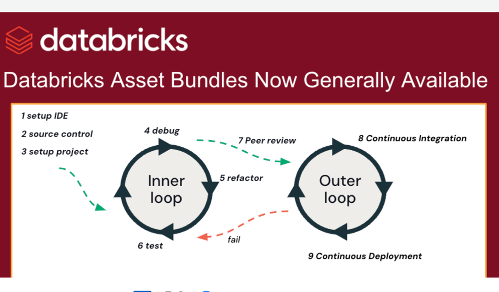
I added a grand total row to a "Count" in SQL, which I needed for some counter visualisations. I used the "ROLL UP" command to get the grand total.

However, I have a pie chart which references the same count, and so the grand total row has been added as a slice on the pie chart (obviously 50% of the pie)

There is no obvious way in the "Edit Visualisation" section to filter out rows.

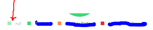
I can click on the relevant legend, which filters the slice out of the pie chart. However the legend itself is still showing on the visualisation, which I don't want. (see underneath red arrow on attached image)

Any ideas how I would get rid of it from this visualization?

I have tried adding filters at Query level, but that also removed the grand total from the counters!

ThanksCapture

2 REPLIES 2

Debayan
Esteemed Contributor III

Hi @harry ryder​ , Could you please confirm when you are try to hide it temporarily what is happening?

https://docs.databricks.com/sql/user/visualizations/charts.html#temporarily-hide-or-show-only-a-seri...

eques_99
New Contributor II

hi, as per the picture above, the slice disappears but the name ("null" in this case) remains on the legend.

Welcome to Databricks Community: Lets learn, network and celebrate together

Join our fast-growing data practitioner and expert community of 80K+ members, ready to discover, help and collaborate together while making meaningful connections. 

Click here to register and join today! 

Engage in exciting technical discussions, join a group with your peers and meet our Featured Members.