- 22111 Views
- 13 replies
- 8 kudos
Grafana + databricks = True?
We have some timeseries in databricks, and we are reading them into powerbi through sql compute endpoints. For timeseries powerbi is ... not optimal. Earlier I have used grafana with various backends, and quite like it, but I cant find any way to con...
- 22111 Views
- 13 replies
- 8 kudos
- 8 kudos
@Erik wrote:We have some timeseries in databricks, and we are reading them into powerbi through sql compute endpoints. For timeseries powerbi is ... not optimal. Earlier I have used grafana with various backends, and quite like it, but I cant find an...
- 8 kudos
- 8763 Views
- 6 replies
- 6 kudos
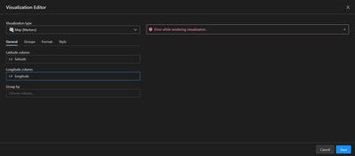
Error While Rendering Visualization -- Map (Markers)
I have a table with latitude and longitude for a few addresses (no more than 10 at the moment) but when I select the appropriate columns in the visualization editor for Map (Markers) I get an message that states "error while rendering visualization"....
- 8763 Views
- 6 replies
- 6 kudos
- 6 kudos
Having the same issue. Every time I update my SQL, all the widgets drop and show the error 'Unable to render visualization'. The only way I found to fix is to manually duplicate all my widgets and delete the old ones with errors, which is a pain and ...
- 6 kudos
- 1907 Views
- 2 replies
- 10 kudos
How to improve visualization and dasboard concepts?
How to improve visualization and dasboard concepts?
- 1907 Views
- 2 replies
- 10 kudos
- 10 kudos
Hi @Priyadarshini G Great to meet you, and thanks for your question! Let's see if your peers in the community have an answer to your question. Thanks.
- 10 kudos
- 6638 Views
- 3 replies
- 1 kudos
When I aggregate over more data, I get the below error message. I've tried multiple ways of diagnosis like going back to a version I know it was w...
When I aggregate over more data, I get the below error message. I've tried multiple ways of diagnosis like going back to a version I know it was working fine (but still got the same error below). Please advise as this is a critical report where the b...
- 6638 Views
- 3 replies
- 1 kudos
- 1 kudos
@Jeff Wu :The error message suggests that there is a syntax error in a SQL statement, specifically near the end of the input. Without the full SQL statement or additional information, it's difficult to pinpoint the exact cause of the error. However,...
- 1 kudos
- 2418 Views
- 2 replies
- 0 kudos
Visulization only from sample of data
When I display dataframe and add visualization, I can see a preview from only a sample of data, and when I confirm it, it is counted from all of the data. Until now, everything is fine. However, when I change the dataframe, the visualization is incon...
- 2418 Views
- 2 replies
- 0 kudos
- 0 kudos
Hi @Ondrej Lostak Hope everything is going great.Just wanted to check in if you were able to resolve your issue. If yes, would you be happy to mark an answer as best so that other members can find the solution more quickly? If not, please tell us so...
- 0 kudos
- 5678 Views
- 1 replies
- 1 kudos
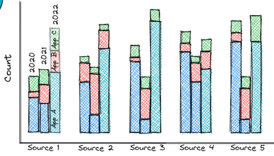
How can I create grouped bars that are also stacked visualization?
I wish to create a visualization combined of grouped bars, and also have those bars stacked.Attached is a sketch of the final result I am interested in.I am also attaching my sql because I'm not sure if I should "group by" in the query or in the visu...
- 5678 Views
- 1 replies
- 1 kudos
- 1 kudos
try to use asc or dsc keyword ,maybe it worked
- 1 kudos
- 13473 Views
- 6 replies
- 7 kudos
Resolved! Wrong X-Axis Order when Visualization is Put on Dashboard
I have a visualization in which the X-axis values are displayed correctly in the Query Editor, in the order produced by the SQL query. However, when I add the visualization to a dashboard, the values are suddenly not sorted anymore.How is this possib...
- 13473 Views
- 6 replies
- 7 kudos
- 7 kudos
We have further analyzed the visualization problem and found two solutions.The original visualization consists of 1 series and has aggregation enabled in the UI (but is unused, since the query itself aggregates already).We found that the following tw...
- 7 kudos
- 8550 Views
- 7 replies
- 2 kudos
How do I enable new Visualization tools in my Databricks notebooks?
Databricks released new visualization toolshttps://docs.databricks.com/notebooks/visualizations/index.htmlBut I don't see them in my notebook (DBR 10.4) nor I can find out how to enable them. How do I use the new tools?
- 8550 Views
- 7 replies
- 2 kudos
- 2 kudos
@Atanu Sarkar , I am still not seeing this. I am running a cluster on runtime 10.4 LTS ML. The "Legacy Visualizations" are the only option available. This feature should be fully deployed, yes?
- 2 kudos
- 13671 Views
- 4 replies
- 5 kudos
Resolved! Is it possible to show multiple cmd output in a dashboard?
I have a loop that outputs a dataframe for values in a list; basically a loop. I can create a dashboard if there is only one df but in the loop, I'm only able to see the charts in the notebook if I switch the view to charts not in the dashboard. In t...
- 13671 Views
- 4 replies
- 5 kudos
- 5 kudos
If you want to be able to easily run and kill multiple process with ctrl-c, this is my favorite method: spawn multiple background processes in a (…) subshell, and trap SIGINT to execute kill 0, which will kill everything spawned in the subshell group...
- 5 kudos
- 4350 Views
- 4 replies
- 7 kudos
Resolved! Visualization of Structured Streaming in job.
Does Databricks have feature or good pattern to visualize the data from Structured Streaming? Something like display in the notebook.
- 4350 Views
- 4 replies
- 7 kudos
- 13298 Views
- 2 replies
- 0 kudos
Resolved! Change size or aspect ratio of ggplot visualizations
I understand that plots in R notebooks are captured by a png graphics device. Is there a way to set the size or the aspect ratio of the canvas? I understand that I can resize the rendered .png by dragging the handle in the notebook, but that means I...
- 13298 Views
- 2 replies
- 0 kudos
- 0 kudos
Hi @sdaza , the answer above didn't change the size somehow, or perhaps I was putting it in the wrong place? I entered it in a new cell before the %sql cell with the plot chart.
- 0 kudos
-
Aad
6 -
ABFS
3 -
Access control
4 -
Access Controls
2 -
Access Data
2 -
Access Databricks
4 -
Access Delta Tables
2 -
Access Token
5 -
Account Console
5 -
AccountPolicy
1 -
Acess Token
2 -
ACL
4 -
Action
4 -
Activate Gift Certificate
1 -
Actual Results
2 -
Adaptive Query Execution
5 -
ADB
8 -
Add
4 -
ADF Pipeline
8 -
ADLS Gen
4 -
ADLS Gen2 Storage
4 -
ADLS Gen2 Using ABFSS
2 -
ADLS Gen2 With ABFSS
2 -
Adls-gen2
5 -
Adlsgen2
10 -
Admin
5 -
Administration
4 -
Administrator
1 -
AdministratorPrivileges
1 -
Advanced Data Engineering
3 -
Aggregations
4 -
Airflow
6 -
Alias
3 -
Alter table
4 -
ALTER TABLE Table
2 -
Amazon
5 -
AML
2 -
Analysisexception
4 -
Analytics
2 -
Announcement
1 -
Apache
2 -
Apache Sedona
2 -
Apache spark
85 -
Apache spark dataframe
1 -
Apache Spark SQL
2 -
ApachePig
3 -
ApacheSpark
1 -
Api Calls
4 -
API Documentation
2 -
Append
5 -
Application
2 -
Aqe
6 -
Architecture
2 -
ARM
3 -
Array
12 -
Array Column
4 -
Arrow Objects
3 -
Article
4 -
Artifacts
2 -
Associate Developer
7 -
Athena
4 -
Audit
3 -
Audit Log Delivery
2 -
Audit Logs
7 -
Authentication
8 -
Autloader
2 -
Auto
7 -
Auto Scaling
2 -
Auto-loader
3 -
Auto-optimize
3 -
Auto-scaling
2 -
Autoloader
91 -
Autoloader Approach
3 -
Autologging
1 -
Automation
5 -
Automl
6 -
AutoML Experiment
3 -
Availability
2 -
Availability Zone
3 -
Avro
8 -
Aws account
5 -
AWS Cloudwatch
3 -
Aws databricks
16 -
AWS Glue Catalog
1 -
Aws Instance
1 -
Aws lambda
3 -
AWS Learn
2 -
AWS S3 Storage
3 -
AWSCloudwatch
1 -
AWSCredentials
1 -
AWSDatabricksCluster
1 -
AWSInstanceProfile
2 -
AWSQuickstart
1 -
AWSSagemaker
1 -
AWSServices
1 -
Azure
413 -
Azure active directory
2 -
Azure Active Directory Tokens
1 -
Azure AD
7 -
Azure blob storage
13 -
Azure Blob Storage Container
2 -
Azure data lake
14 -
Azure data lake gen2
2 -
Azure Data Lake Storage
7 -
Azure data lake store
2 -
Azure databricks
310 -
Azure Databricks Delta Table
1 -
Azure Databricks Job
2 -
Azure Databricks SQL
4 -
Azure databricks workspace
4 -
Azure DBX
2 -
Azure Delta Lake
2 -
Azure devops integration
7 -
Azure event hub
7 -
Azure functions
3 -
Azure key vault
4 -
Azure Service Principal
3 -
Azure sql data warehouse
2 -
Azure sql database
3 -
Azure SQL DB
2 -
Azure Sql Server
2 -
Azure Storage
11 -
Azure Storage Account
8 -
Azure synapse
1 -
Azure Unity Catalog
3 -
Azure vm
4 -
Azure workspace
4 -
Azure-cosmosdb-sqlapi
2 -
Azure-databricks
3 -
Azureblob
3 -
AzureDatabricks
12 -
AzureDatalake
1 -
AzureDevopsRepo
2 -
AzureEnvironments
1 -
AzureFunctionsError
1 -
AzureHbase
1 -
AzureKeyVault
3 -
AzureLakeGen
1 -
AzureManagement
1 -
AzureMaps
1 -
AzureML
1 -
AzurePipelines
1 -
AzureRepos
2 -
AzureSchemaRegistry
1 -
Azuresql
2 -
AzureSQLWarehouse
1 -
AzureStorage
6 -
AzureSynapse
1 -
Backend Service
3 -
Backup
4 -
Backup-restore
1 -
Badge
1 -
Bamboolib
2 -
Bangalore
2 -
Batch Duration
1 -
Batch Process
2 -
Batch Processing
4 -
BatchJob
5 -
BatchPrediction
1 -
Best Architecture
3 -
Beta
1 -
Better Way
1 -
BI Integrations
7 -
BI Tool
2 -
Big data
8 -
Big Files
2 -
Bigquery
8 -
Billing
3 -
Billing and Cost Management
8 -
Binary data
2 -
Binary file
3 -
Binary Incompatibility
2 -
Blob
11 -
Blob-storage
3 -
BlobData
1 -
BlobHash
1 -
BlobStorageContainer
1 -
Blog
1 -
Blog Post
1 -
Bloom Filter
3 -
BloomFilterIndex
2 -
Body
3 -
Bootstrap Timeout
4 -
Broadcast variable
2 -
BroadcastJoin
4 -
Bronze Layer
3 -
Bronze Table
4 -
BTW
1 -
Bucket
7 -
Bucketing
3 -
Business Analytics
2 -
BYOK Notebook
2 -
Caching
1 -
Cartesian
2 -
CASE Statement
2 -
Cassandra
1 -
Cast
3 -
CatalogFeature
1 -
Catalyst
2 -
CatalystOptimizer
1 -
CD Pipeline
3 -
Centralized Model Registry
1 -
Certfication
5 -
Certificate
23 -
Certificate & Badge
1 -
Certificate And Badge
2 -
Certificates
2 -
Certification
40 -
Certification Exams
6 -
Certification issues
3 -
Certification Voucher
12 -
Certification Vouchers
1 -
Certified Data Engineer Professional
1 -
Certified Machine Learning Associate
1 -
Change
8 -
Change Data
7 -
Change data capture
6 -
Change Data Feed
4 -
Change Logs
1 -
ChangeFeed
2 -
ChangingDimensions
1 -
Check
1 -
Checkpoint
12 -
Checkpoint Directory
3 -
Checkpoint File
2 -
Checkpoint Path
4 -
Child Notebook
2 -
Chrome
5 -
Chrome driver
4 -
Ci
3 -
Class
6 -
Class Class
1 -
Classification Model
1 -
Clean up files
2 -
Client Secret
2 -
CloneRepository
4 -
Cloud
7 -
Cloud Instance
2 -
Cloud Provider Launch Failure
2 -
Cloud Storage
3 -
Cloud_files_state
2 -
CloudFiles
7 -
CloudFormation
6 -
Cloudformation Error
5 -
Cloudwatch
3 -
Cluster
163 -
Cluster Autoscaling
4 -
Cluster config
3 -
Cluster Creation
2 -
Cluster Failed To Launch
3 -
Cluster Init Script
3 -
Cluster Metrics
2 -
Cluster Mode
2 -
Cluster Modes
2 -
Cluster monitoring
2 -
Cluster Policies
3 -
Cluster policy
2 -
Cluster Pools
3 -
Cluster provisioning
5 -
Cluster Start
5 -
Cluster Termination
2 -
ClusterACL
2 -
ClusterConfiguration
1 -
ClusterCreation
1 -
ClusterDefinition
1 -
Clustering
1 -
ClusterIssue
1 -
ClusterLaunch
1 -
ClusterLibraries
1 -
Clusterlogs
1 -
ClusterMaxWorkers
1 -
ClusterMode
1 -
ClusterOptimization
1 -
Clusters Users
2 -
ClusterSettings
1 -
ClusterSize
2 -
ClusterSQLEndpoints
1 -
ClusterStartTime
2 -
ClusterUsage
1 -
ClusterVersion
1 -
ClusterWeb
1 -
Cmd File
2 -
CMK
4 -
CNN HOF
1 -
Code Block
2 -
Collect
3 -
Collect_set
3 -
Collibra
1 -
Column names
5 -
Column Values
2 -
ColumnLevelSecurity
1 -
ColumnPosition
1 -
ColumnType
2 -
Command
13 -
Command execution
2 -
Comments
4 -
Common Key
2 -
Community Champion
1 -
Community Edition
53 -
Community Edition Account
3 -
Community Edition Login Issues
1 -
Community Edition Password
2 -
Community Group
1 -
Community Members
1 -
Community Version
2 -
Compaction
2 -
Company Email
10 -
Complete Certification
1 -
Complex Json File
3 -
Complex Transformations
3 -
Compliance
2 -
Compression
2 -
Compute
2 -
Compute Instances
2 -
Concurrency
7 -
Concurrency Control
1 -
Concurrent notebooks
3 -
Concurrent Runs
2 -
Concurrent Writes
2 -
ConcurrentNotebook
1 -
Condition
4 -
Config
5 -
Configure
2 -
Configure Databricks
3 -
Configure Job
2 -
Confluent Cloud
1 -
Confluent Schema Registry
2 -
ConfluentKstream
1 -
Congratulate Malleswari
1 -
Connection
13 -
Connection error
3 -
Connection String
2 -
Connections
2 -
Connectivity
4 -
Console
2 -
Container
4 -
Containerized Databricks
2 -
ContainerServices
1 -
ContainerThreshold
1 -
Content
6 -
Continuous Integration Pipeline
2 -
Continuous Jobs
2 -
Control Plane
4 -
ControlPlane
2 -
Copy
9 -
Copy File Path
2 -
Copy into
3 -
COPY INTO Statement
2 -
CosmodDB
1 -
CosmosDB
4 -
Cost Optimization Effort
1 -
CostExplorer
1 -
CostLimits
1 -
CostOptimization
2 -
CostOptimized
1 -
Couchbase
1 -
Count
3 -
Course
6 -
Course Code
1 -
Courses
2 -
Create function
2 -
Create table
5 -
Creating
4 -
Creating cluster
4 -
Creation
2 -
Credential passthrough
6 -
Credentials
5 -
Cron Syntax
1 -
Crossjoin
1 -
CSV Export
2 -
CSV File
12 -
Csv files
6 -
Ctas
2 -
CURL
1 -
Current Cluster
2 -
Current Date
8 -
Custom Catalog
2 -
Custom Docker Image
4 -
Custom Python
2 -
CustomClusterTag
1 -
CustomContainer
2 -
CustomDockerContainer
1 -
Customer Academy
1 -
Customer Record
2 -
CustomJDBC
1 -
CustomLibrary
2 -
Dashboards
8 -
Data
152 -
Data + AI Summit
1 -
Data + AI World Tour 2022
5 -
Data AI Summit
1 -
Data Analyst
3 -
Data Architecture
2 -
Data Directories
2 -
Data Engineer Associate
23 -
Data Engineer Associate Certificate
4 -
Data Engineering
33 -
Data Explorer
7 -
Data factory
5 -
Data Governance
2 -
Data Ingestion
8 -
Data Ingestion & connectivity
150 -
Data load
4 -
Data Mesh
2 -
Data Pipeline
8 -
Data Processing
2 -
Data Quality
3 -
Data Quality Checks
3 -
Data Science & Engineering
2 -
Data Source Mongodb
2 -
Data Tab
2 -
Data Type Conversion
2 -
Data warehouse
5 -
Database
15 -
DatabaseOperations
1 -
DatabaseOwner
1 -
DatabaseSchema
1 -
Databrciks Runtime
1 -
Databrick Certification
1 -
Databrick Job
5 -
databricks
85 -
Databricks Academy
29 -
Databricks Account
10 -
Databricks Account API
1 -
Databricks Alerts
12 -
Databricks api
12 -
Databricks autoloader
12 -
Databricks aws
3 -
Databricks Badge
3 -
Databricks Certificate
1 -
Databricks Certification
15 -
DataBricks Certification Exam
2 -
Databricks Certified
13 -
Databricks Certified Data Engineer Professional
2 -
Databricks cli
14 -
Databricks cloud
4 -
Databricks Cluster
68 -
Databricks Clusters
11 -
Databricks Community
32 -
Databricks community edition
30 -
Databricks Community Edition Account
4 -
Databricks Community Post
2 -
Databricks Community Rewards
2 -
Databricks Community Rewards Store
4 -
Databricks Community Version
2 -
Databricks connect
9 -
Databricks Control Plane
3 -
Databricks Course
2 -
Databricks Customers
1 -
Databricks Dashboard
5 -
Databricks Data Engineer Associate
4 -
Databricks Data Engineering Associate
4 -
Databricks Database
2 -
Databricks dbfs
5 -
Databricks delta
14 -
Databricks Delta Table
3 -
Databricks Documentation
1 -
Databricks Error Message
4 -
DataBricks Extension
6 -
Databricks Feature Store
4 -
Databricks Fundamentals
2 -
Databricks IDE
3 -
Databricks Instance
5 -
Databricks Integration
2 -
Databricks Issue
5 -
Databricks JDBC Driver
9 -
Databricks Job
33 -
Databricks JobAPIs
2 -
Databricks Jobs Connection Timeout
2 -
Databricks Lakehouse
6 -
Databricks Lakehouse Fundamentals
5 -
Databricks Lakehouse Fundamentals Badge
8 -
Databricks Lakehouse Platform
14 -
Databricks Logs
4 -
Databricks Migration
2 -
Databricks Mlflow
1 -
Databricks News
2 -
Databricks notebook
155 -
Databricks Notebooks
34 -
Databricks ODBC
5 -
Databricks Partner
7 -
Databricks Partner Academy
2 -
Databricks Platform
7 -
Databricks Premium
3 -
Databricks Pricing
2 -
Databricks Pyspark
2 -
Databricks Python Notebook
1 -
Databricks Repo
6 -
Databricks Resources
4 -
Databricks rest api
6 -
Databricks run time version
4 -
Databricks Runtime
67 -
Databricks secrets
4 -
Databricks Service Account
5 -
Databricks spark
5 -
Databricks Spark Certification
4 -
Databricks SQL
192 -
Databricks SQL Alerts
4 -
Databricks SQL Analytics
1 -
Databricks SQL Connector
4 -
Databricks SQL Dashboard
4 -
Databricks SQL Dashboards
4 -
Databricks SQL Endpoints Runtime
2 -
Databricks SQL Permission Problems
1 -
Databricks Sql Serverless
4 -
Databricks SQL Visualizations
2 -
Databricks SQL Warehouse
4 -
Databricks Support
2 -
Databricks table
7 -
Databricks Tables
2 -
Databricks Team
5 -
Databricks Terraform
4 -
Databricks Token
2 -
Databricks Training
2 -
Databricks UI
8 -
Databricks Unity Catalog
4 -
Databricks upgrade
2 -
Databricks User Group
1 -
Databricks Users
2 -
Databricks V2
5 -
Databricks version
3 -
Databricks Workflow
4 -
Databricks Workflows
13 -
Databricks workspace
54 -
Databricks-cli
7 -
Databricks-connect
24 -
Databricks-sql-connector
2 -
DatabricksAcademy
5 -
DatabricksAPI
1 -
DatabricksAuditLog
1 -
DatabricksAWSAccount
1 -
DatabricksClusterAutoscaling
1 -
DatabricksClusterCreation
2 -
DatabricksClusterDeltaTables
1 -
DatabricksClusterInitScripts
1 -
DatabricksClusterManager
1 -
DatabricksContainer
3 -
DatabricksEBS
1 -
DatabricksEMR
1 -
DatabricksEncryption
1 -
DatabricksFunctions
1 -
DatabricksGanglia
1 -
DatabricksJobCluster
2 -
DataBricksJobOrchestration
1 -
DatabricksJobRunTime
1 -
DatabricksJobsUI
1 -
DatabricksRuntime
5 -
DatabricksVPC
1 -
DatabricksWorkflows
5 -
DatabricksWorkspace
2 -
Databrics Notebook
2 -
DataCleanroom
1 -
Datadog
7 -
DataFabric
1 -
Dataframe
104 -
Dataframe Rows
2 -
Dataframes API
2 -
Datagrip
1 -
DataLakeGen2
1 -
DataObjects
1 -
Dataset
10 -
Datasets
5 -
DataSkipping
1 -
Datasource
2 -
DataStorage
3 -
DataStreaming
1 -
Datatype
7 -
DataVisualization
1 -
Date Column
4 -
Date Field
4 -
Dateadd
1 -
DateFunction
2 -
DateGraph
1 -
DatePartition
1 -
DateSchema
1 -
Datetime
1 -
DatetimeFilter
1 -
DateValue
1 -
DB
2 -
DB Academy
2 -
DB Connect
6 -
DB Experts
1 -
DB Notebook
6 -
DB Runtime
2 -
DBC File
3 -
DBCSQL
1 -
DBeaver
4 -
DBFS
66 -
Dbfs - databricks file system
11 -
DBFS FileStore
6 -
DBFS Rest Api
1 -
DBFS Root
3 -
DBR 9.1
3 -
DBR Versions
6 -
DBRuntime
1 -
DBSQL
10 -
Dbsqlcli
3 -
Dbt
5 -
Dbu
9 -
DBU Consumption
2 -
Dbutils.notebook.run
3 -
DDL
6 -
DDP
1 -
DE
4 -
Deadline
2 -
Dear Community
2 -
Dear Experts
2 -
Debug
2 -
Decimal
4 -
DecimalDataType
5 -
Deep Clone
2 -
Deep learning
4 -
DeepLearning
1 -
Default Cluster
2 -
Default Location
3 -
Default Python Functions
2 -
Default Value
5 -
Delete
8 -
Delete File
4 -
Delete Table
2 -
Delete User
2 -
Delt Lake
45 -
Delta Cache
4 -
Delta Clone
3 -
Delta engine
3 -
Delta File
3 -
Delta Files
6 -
Delta Format
12 -
Delta History
3 -
Delta Lake
106 -
Delta Lake Files
2 -
Delta lake table
12 -
Delta Lake Upsert
2 -
Delta Live
10 -
Delta Live Pipeline
3 -
Delta Live Table Pipeline
6 -
Delta Live Table Pipelines
2 -
Delta Live Tables
94 -
Delta log
7 -
Delta Log Folder
2 -
Delta Pipeline
4 -
Delta Sharing
14 -
Delta STREAMING LIVE TABLE
3 -
Delta Table Column
2 -
Delta Table Mismatch
2 -
Delta Tables
54 -
Delta Time Travel
2 -
Delta-lake
7 -
DeltaLake
10 -
DeltaLiveTable
1 -
DeltaLog
5 -
Deploy
7 -
Deployment
6 -
DESC
2 -
DESCRIBE DETAIL
2 -
Deserializing Arrow Data
3 -
Design pattern
2 -
Details
2 -
Dev
7 -
Developer
2 -
Development
2 -
DevOps
6 -
Df
2 -
Different Account
1 -
Different Environments
2 -
Different Instance Types
1 -
Different Notebook
2 -
Different Notebooks
4 -
Different Number
2 -
Different Parameters
4 -
Different Results
3 -
Different Schema
4 -
Different Tables
2 -
Different Types
5 -
Directory
7 -
Disable
2 -
Display Command
2 -
Displayhtml
5 -
Distinct Values
5 -
Distribution
2 -
DLT
163 -
DLT Pipeline
34 -
DLT Pipelines
4 -
DLTDataPlaneException
1 -
DLTDataQuality
1 -
DLTIntegration
1 -
DLTNotebook
1 -
DLTs
3 -
DLTSecurity
1 -
DML
6 -
Dns
5 -
Docker File
2 -
Dockerized Cluster
2 -
Dolly
1 -
Dolly Demo
1 -
Download
4 -
Download files
2 -
Downloading Files
2 -
DRIVER Garbage Collection
2 -
DriverLogs
5 -
DriverNode
3 -
Drop table
3 -
Duplicate Records
3 -
Duplicate Rows
2 -
Dynamic
4 -
Dynamic Data Masking Functionality
2 -
Dynamic Partition
2 -
Dynamic Queries
2 -
Dynamic Variables
3 -
E2 Architecture
2 -
E2 Workspace
5 -
Easy Way
4 -
EBS
6 -
EC2
6 -
Efficient Way
1 -
Elasticsearch
2 -
Emr
5 -
Encrypt
2 -
Encryption
5 -
Encyption
4 -
End Date
3 -
End Time
3 -
Entry Point
2 -
Environment Variable
2 -
Environment variables
2 -
EphemeralNotebookJobs
1 -
Epoch
1 -
Error Column
2 -
Error Details
2 -
Error handling
3 -
Error Messages
4 -
Escape Character
2 -
ETA
2 -
ETL Pipelines
2 -
ETL Process
3 -
Event
4 -
EventBridge
1 -
Eventhub
12 -
Eventlogs
2 -
Exam Vouchers
3 -
Example
6 -
Exception Handling
6 -
Execution Context
2 -
Executor Logs
3 -
Executor Memory
3 -
Exists
3 -
Expectations
3 -
Experiments
2 -
ExportError
1 -
Extension
5 -
External Command
1 -
External Hive
2 -
External Metastore
4 -
External Sources
3 -
External Table
11 -
External Tables
6 -
Extract
4 -
Fact Tables
1 -
FAILED
5 -
Failure
9 -
Fatal Error
3 -
Feature Lookup
1 -
Feature request
3 -
Feature Store
12 -
Feature Store Table
2 -
Feature Table
4 -
Feature Tables
1 -
Features
4 -
FeatureStore
1 -
Field Names
2 -
File Notification
2 -
File Notification Mode
5 -
File Path
4 -
File Size
3 -
File Trigger
2 -
Filenotfoundexception
3 -
Files In Repos
2 -
Filestore
8 -
Filesystem
4 -
Filter
11 -
Filter Condition
2 -
Fine Grained Access
2 -
Fine Tune Spark Jobs
1 -
Firefox
2 -
Firewall
4 -
Fivetran
6 -
Flat File
2 -
Fm World Shop
2 -
Folder
3 -
Folder Structure
2 -
Folders
5 -
Ford Fiesta
2 -
Foreachbatch
7 -
Foreachpartition
5 -
Forgot Password
1 -
Format
4 -
Format Issue
3 -
FORMAT OPTIONS
2 -
Formatting Options
2 -
Free Databricks
1 -
Free trial
1 -
Free Voucher
6 -
friendsofcommunity
3 -
Fundamentals Accreditation
6 -
Fundamentals Certificate
1 -
Fundamentals Certification
1 -
GA
3 -
GAM
1 -
Ganglia
6 -
Garbage Collection
6 -
Garbage Collection Optimization
1 -
Gc
3 -
GCP Databricks
6 -
Gcs
7 -
Gdpr
2 -
GENERATED ALWAYS
3 -
GENERATED ALWAYS AS IDENTITY
4 -
GeopandasDataframe
1 -
Getting started
4 -
Gift Certificate
3 -
Git Integration
3 -
Git Repo
4 -
Github
15 -
Github actions
3 -
Github integration
3 -
Github Repo
2 -
Gitlab
7 -
GitlabIntegration
1 -
GKE
2 -
Global
1 -
Global Init Script
5 -
Global init scripts
3 -
Global Temporary View
2 -
Glue
1 -
Golang
3 -
GoldLayer
5 -
Google Bigquery
2 -
Google cloud
4 -
GoogleAnalytics
1 -
Governance
1 -
Grafana
2 -
Grant
4 -
Graph
5 -
Graphframes
3 -
Graphx
2 -
Graviton
2 -
Great Expectations
2 -
Gridsearchcv
2 -
Group
2 -
Group-by
2 -
Groupby
5 -
Groupby Window Queries
2 -
Groups
5 -
Gui
3 -
Guide
6 -
Gzip
2 -
H2o
2 -
Hadoop
6 -
HBase
3 -
Header
2 -
Heading
2 -
Heap dump
2 -
Help Check
2 -
Hi
9 -
High Concurrency
5 -
High Concurrency Cluster
8 -
HIPAA
3 -
History
6 -
Hive metastore
11 -
Hive Metastore Of Databricks
1 -
Hive Table
4 -
Horovod
3 -
Href
2 -
Html
9 -
HTML Format
3 -
Http
3 -
Https
1 -
Hudi
1 -
Huge Data
2 -
Hyperopt
5 -
Hyperparameter Tuning
5 -
Iam
5 -
IBM
2 -
Iceberg
5 -
Ide
6 -
IDE Dev Support
7 -
Idea
3 -
Ignite
3 -
ILT
1 -
Image
5 -
Image Data
3 -
Implementation Patterns
2 -
Import notebook
5 -
Import Pandas
4 -
Importing
3 -
Include
3 -
Incremental
3 -
Incremental Data
3 -
Index
2 -
Inference Setup Error
1 -
INFORMATION
2 -
Ingestion
4 -
Init
4 -
Input
3 -
Insert
5 -
Insert Overwrite
2 -
Installation
1 -
Instance Pool
2 -
Instance Profile
6 -
Instances
2 -
Int
9 -
Integer
2 -
Integration
7 -
Integrations
2 -
Intellij
2 -
Interactive cluster
9 -
Interactive Mode
2 -
Internal error
6 -
Internal Metastore
2 -
Interval
2 -
Invalid Email Address
1 -
INVALID PARAMETER VALUE
3 -
Invalid Type Code
2 -
IP
6 -
IP Access
2 -
IP Access List
4 -
IP Addresses
2 -
Ipython
3 -
IPython Version
2 -
Ipywidgets
7 -
JAR Library
4 -
Jar Scala
3 -
Jars
3 -
Java version
2 -
Java.lang.NoSuchMethodError
2 -
Javapackage
3 -
Jdbc connection
12 -
JDBC Connections
4 -
JDBC Connector
4 -
Jira
1 -
JMS
1 -
Job
91 -
Job clusters
9 -
Job Definition
2 -
Job Orchestration
3 -
Job Parameters
6 -
Job Run
10 -
Job Runs
2 -
Job Task
2 -
Job_clusters
2 -
Joblib
3 -
Jobs Cluster
2 -
Join
8 -
Joins
4 -
Json Format
3 -
JSON Object
4 -
Jsonfile
9 -
Jupyter
4 -
Jvm
8 -
Kafka consumer
2 -
Kafka Stream
3 -
Kafka streaming
2 -
Kafka Topic
4 -
Kaniz
2 -
KB
4 -
Key
7 -
Key Management
1 -
Key Vault
2 -
Kinesis
1 -
Kinesis and spark streaming
2 -
Koalas
8 -
Koalas Dataframe
3 -
Lakehouse
36 -
Lakehouse Fundamentals Certificate
2 -
Lakehouse Fundamentals Certification
2 -
Lakehouse Fundamentals Quiz
1 -
Lakehouse Fundamentals Training
5 -
Large Datasets
1 -
Large Language Model
1 -
Large Number
3 -
Large Volume
2 -
Large XML File
2 -
Latest Version
1 -
Launch Failure
3 -
LDP
1 -
Learning
3 -
Learning Material
1 -
Library Installation
6 -
Limit
4 -
Line
3 -
Lineage
3 -
Link
7 -
Linkedin
3 -
Live Table
9 -
Live Tables
8 -
Live Tables CDC
3 -
LLM
4 -
Load
6 -
Load data
7 -
Loading
5 -
Local computer
3 -
Local Development
2 -
Local file
4 -
Local Files
2 -
Local Machine
4 -
Local System
2 -
Location
7 -
Log Analytics
3 -
Log Model
1 -
Log4j
6 -
Logging
10 -
Login
9 -
Login Account
2 -
Login Issue
2 -
Login Sessions
2 -
Logs
13 -
Long Time
9 -
Loop
9 -
Lower Case
3 -
LTS ML
4 -
LTS Version
2 -
M1 Macbookpro
2 -
Machine
2 -
Machine Learning
20 -
Machine Learning Associate
2 -
Magic Command
7 -
Magic Commands
5 -
Main Contact Page
1 -
Main Notebook
4 -
MALFORMED REQUEST
4 -
Managed Resource Group
2 -
Managed Table
4 -
Management
1 -
Map
7 -
Markdown
6 -
Market Place
2 -
Masking Data Column
2 -
Master Notebook
2 -
Materialized Tables
2 -
Matplotlib
5 -
Maven Artifact
2 -
Maven Libraries
4 -
Max Number
2 -
Max Retries
3 -
Maximum Number
4 -
Medallion Architecture
7 -
Memory
10 -
Memory error
4 -
Memory management
2 -
Memory Size
3 -
MERGE Performance
5 -
MERGE Statement
3 -
Metadata
7 -
Metadata File
2 -
Method
8 -
Method Public
1 -
Metrics
6 -
MicroBatch
2 -
Microsoft azure
3 -
Microsoft Teams
1 -
Microstrategy
3 -
Migration
11 -
Missing
3 -
ML Runtime
3 -
MlFlow
37 -
MLflow API
1 -
MLflow Experiment
2 -
MLflow Experiments
3 -
Mlflow Model
4 -
Mlflow Run
3 -
Mlflow Server
1 -
Mllib
5 -
Model Deployment
7 -
Model Lifecycle
2 -
Model Monitoring
1 -
Model registry
4 -
Model Serving REST API
1 -
Model Training
4 -
Model Tuning
1 -
Models
4 -
Module
6 -
Modulenotfounderror
4 -
Modules
3 -
Monaco
2 -
MongoDB
4 -
MongoDB Server
1 -
Monitoring
8 -
Mount Point
6 -
Mount point data lake
3 -
Mounting-azure-blob-store
2 -
Mountpoints Definitions
3 -
Mounts
2 -
MS SQL Server
4 -
MSExcel
1 -
Mssql
4 -
Multi
5 -
Multi-Task Job
3 -
Multiline
2 -
Multiple
2 -
Multiple Dependent Jobs
2 -
Multiple Jobs
5 -
Multiple Notebooks
2 -
Multiple Queries
3 -
Multiple Sources
3 -
Multiple Spark
2 -
Multiple Tabs
2 -
Multiple Tasks
8 -
Multiple Versions
2 -
Multiselect
2 -
Mysql
6 -
MySQLDB
2 -
Navigational Pane
3 -
Nested
2 -
Nested json
3 -
Network Security
3 -
Networking
5 -
NetworkSecurityGroup
2 -
New Account
3 -
New Column
7 -
New Connection
2 -
New Data
5 -
New Feature
4 -
New Features
6 -
New File
3 -
New Job
4 -
New Jobs
2 -
New LMS Migration
2 -
New Metastore
2 -
New Releases
2 -
New Rows
3 -
New Table
4 -
New User
3 -
New Workspace
9 -
Newbie
2 -
Nlp
2 -
Nodes
3 -
Note
1 -
Notebook
135 -
Notebook Cell
7 -
Notebook Cell Output Results
2 -
Notebook Dashboard
3 -
Notebook Display Widgets
3 -
Notebook Level
2 -
Notebook Names
2 -
Notebook Path
6 -
Notebook Results
2 -
Notebook Run
5 -
Notebook Task
5 -
Notification
5 -
Null
6 -
Null Value
3 -
Null Values
7 -
Nullpointerexception
2 -
Number
4 -
Numpy Arrays
2 -
Nutter
2 -
Object
12 -
Odbc Connection
2 -
Old Versions
2 -
Older Version
2 -
On-premises
2 -
Onboarding
9 -
Online Feature Store Table
1 -
OOM Error
5 -
OpenAI
1 -
Operation
10 -
Optimization
7 -
Optimize Command
9 -
Options
5 -
Oracle
14 -
OracleDBPackage
3 -
Orchestrate Data Bricks Jobs
2 -
Orchestration
2 -
Order By
3 -
Organize
1 -
OSS
4 -
Output
6 -
Overwrite
3 -
Packages
3 -
Pakistan
3 -
Pandas API
2 -
Pandas Code
2 -
Pandas Python
3 -
Pandas udf
5 -
Pandas_udf
3 -
Paper
1 -
Paper Airplane
2 -
Parallel
2 -
Parallel notebooks
3 -
Parallel processing
8 -
Parallel Runs
2 -
Parallelisation
2 -
Parallelism
2 -
Parameter
8 -
PARAMETER VALUE
5 -
Parameters
10 -
Parquet file writes
4 -
Parquet Format
2 -
Parquet Table
5 -
Parser
3 -
Particular Cluster
2 -
Partition Column
4 -
Partition Columns
3 -
Partitioning
9 -
Partitions
12 -
Partner Academy
4 -
Pass
5 -
Password Reset Link
3 -
Pattern
4 -
Pending State
2 -
Percentage Values
2 -
Performance Issue
4 -
Performance Issues
5 -
Performance Tuning
6 -
Permissions
8 -
Persist
3 -
Persistent View
3 -
Petastorm
2 -
Photon Engine
6 -
Pickle
2 -
PII
2 -
Pip
9 -
Pipeline
8 -
Pipelines
5 -
Plan
3 -
Platform
5 -
Platform Administrator
1 -
Plotly
2 -
POC
5 -
Points
4 -
Pool
2 -
Pools
5 -
Possible
10 -
Post
4 -
Postgres
5 -
Postgresql
3 -
Postgresql RDS
2 -
PostgresSQL
1 -
Power BI Connector
1 -
Power BI XLMA EndPoint
2 -
Power-bi
2 -
Powerbi
23 -
Powerbi Databricks
3 -
Practice Exams
2 -
Practice Tests Details
1 -
Premium
3 -
Premium Workspace
2 -
Presto
3 -
Previous Version
2 -
Primary Key
6 -
Primary Key Constraint
2 -
Print
6 -
Private Link
4 -
Private Network
6 -
Privilege
2 -
Process List
2 -
Product Feedback
2 -
Product Manager
3 -
Profile
3 -
Programming language
1 -
Project Lightspeed
2 -
Promotion Code Used
2 -
Property
3 -
Protobuf
2 -
Public
5 -
Public Preview
6 -
Purpose Cluster
5 -
Purpose Clusters
2 -
Py File
7 -
Py4jjavaerror
5 -
Pycharm
3 -
PyPI
3 -
Pysaprk dataframes
2 -
Pyspark
201 -
Pyspark Code
4 -
Pyspark Databricks
5 -
Pyspark Dataframes
4 -
PySpark Error
3 -
Pyspark job
2 -
PySpark Jobs
2 -
Pyspark Scripts
2 -
Pyspark Session
2 -
Pyspark Spark Listener
3 -
PySpark UDF
2 -
Pyspark.pandas
2 -
PysparkML
1 -
Pytest
3 -
Python
230 -
Python API
2 -
Python Code
11 -
Python Dataframe
2 -
Python Dictionary
3 -
Python Function
6 -
Python Kernel
7 -
Python Libraries
4 -
Python Library
5 -
Python Notebooks
4 -
Python package
5 -
Python Packages
1 -
Python programming
1 -
Python Project
2 -
Python Proxy
1 -
Python Variables
2 -
Python Wheel
6 -
Python Wheel Task
5 -
Python3
8 -
Pytorch
3 -
Q2
2 -
Query Data
3 -
Query Editor
3 -
Query Execution Plan
2 -
Query History
6 -
Query Limit
3 -
Query Parameters
2 -
Query Plan
2 -
QUERY RESULT ROWS
3 -
Query Results
4 -
Query Table
5 -
Query Tables
2 -
QUERY_RESULT_ROWS
2 -
Quickstart
2 -
Rakesh
2 -
Random Error
2 -
Ray
5 -
Rds
2 -
Read data
4 -
Read from s3
3 -
Read Table
2 -
Read write files
2 -
Reading
11 -
Readstream
4 -
Real Data
2 -
Real Time
5 -
Real time data
4 -
Real Time Model Serving
2 -
REATTEMPT
3 -
Records
5 -
Redshift
9 -
Regex
3 -
Region
1 -
Remote connection integration client
2 -
Remote Repository
2 -
Remote RPC Client
2 -
Remove
3 -
Repartitioning
3 -
Repl
4 -
Repos Support
2 -
Repository
5 -
Reset
2 -
Resource Group
2 -
Rest-api
2 -
RESTAPI
4 -
Restart
5 -
Restart Cluster
2 -
Restore
2 -
Result
5 -
Result Rows
2 -
Return
2 -
Reward Points
3 -
Rewards Points
1 -
Rewards Portal
2 -
Rewards Store
3 -
Rmysql
2 -
Roadmap
1 -
Rocksdb
2 -
Rollback Error
2 -
Root Bucket
3 -
ROOT_DIR
2 -
Row
7 -
Row Level Security
4 -
Rpc
4 -
Run Cell
2 -
Run Command
3 -
Run Now
2 -
Running notebook in databricks cluster
2 -
Runs
4 -
Runtime 10.4
8 -
Runtime 11.3
3 -
Runtime SQL Endpoints
1 -
Runtime update
1 -
S3 Location
2 -
S3 Path
2 -
SA
1 -
Sagemaker
1 -
Salesforce
7 -
Sample Code
3 -
SAP
5 -
Sap Hana Driver
2 -
Sas
6 -
Scala
65 -
Scala Application Jar
2 -
Scala Code
3 -
Scala Connectivity
1 -
Scala Function
3 -
Scala Libraries
1 -
Scala notebook
11 -
Scala spark
13 -
Scalable Machine Learning
2 -
Scaling
2 -
SCD Type
2 -
Scd Type 2
2 -
Schedule
2 -
Schedule Cron Expression
3 -
Schedule Job
2 -
Scheduling
2 -
Schema Enforcement
1 -
Schema evolution
8 -
Schema Evolution Issue
3 -
Schema registry
2 -
Scikit-learn
3 -
SCIM API
3 -
Scope
3 -
Scope Credentials
1 -
Scoped Init Script
3 -
Script
3 -
SDK
4 -
Search
4 -
Search Function
1 -
Secret Scopes
5 -
Secrets
8 -
Secrets API
2 -
Security
24 -
Security Analysis Tool
3 -
Security Controls
2 -
Security Exception
1 -
Security Group
3 -
Security Patterns
1 -
Security Review
1 -
Sedona
3 -
Select
2 -
Selenium
4 -
Selenium Webdriver
2 -
Selfpaced Course
2 -
Semi-structured Data
1 -
Serialization
3 -
Server
1 -
Serverless
2 -
Serverless SQL Endpoints
4 -
Service
3 -
Service Account
2 -
Service Principals
2 -
Service principle
4 -
Serving
1 -
Session
5 -
SET Statements
2 -
Setup
7 -
SFTP
5 -
SFTP Location
2 -
Sftp Server
2 -
Shallow Clone
3 -
Shap
1 -
Shared Folder
2 -
Shared Mode
1 -
SharePoint
5 -
Sharing
4 -
Shell script
1 -
Show
2 -
Shuffle
4 -
Shuffle Partitions
2 -
Simba
5 -
Simba jdbc
2 -
Simba ODBC Driver
3 -
Simba Spark Driver
2 -
Simple Autoloader Job
1 -
Single CSV File
1 -
Single Node
5 -
Size
6 -
Skew
3 -
Sklean Pipeline
2 -
Sklearn
4 -
SLA
3 -
Slow
5 -
Slow Performance
2 -
Small Data
1 -
Small Dataframes
2 -
Small Files
5 -
Small Parquet Files
1 -
Small Scale Experimentation
1 -
Snowflake Connector
1 -
Snowflake Spark Connector
2 -
Software
2 -
Software Development
2 -
Sorting
3 -
Source
5 -
Source Code
2 -
Source control
1 -
Source Data
3 -
Source Data Size
1 -
Source Error
1 -
Source Systems
2 -
Source Table
6 -
Spaces
3 -
Spam Post
1 -
Spanish
1 -
Spark
157 -
Spark & Scala
3 -
Spark application
3 -
Spark Caching
2 -
Spark Catalog
1 -
Spark checkpoint
2 -
Spark Cluster
4 -
Spark Code
2 -
Spark config
14 -
Spark Configuration
2 -
Spark Connect
2 -
Spark connector
1 -
Spark databricks
2 -
Spark DataFrames
3 -
Spark Error
1 -
Spark jdbc
1 -
Spark JDBC Query
2 -
Spark job
14 -
Spark jobs
2 -
Spark Meetup
1 -
Spark MLlib
5 -
Spark monitoring
4 -
Spark Pandas Api
3 -
Spark Performance
5 -
Spark Plan
1 -
Spark scala
5 -
Spark sql
87 -
Spark Stream
3 -
Spark structured streaming
33 -
Spark udf
2 -
Spark ui
16 -
Spark UI Simulator
2 -
Spark Version
4 -
Spark view
2 -
Spark--dataframe
12 -
Spark--sql
6 -
Spark-streaming
3 -
Spark-submit
4 -
SparkCluster
2 -
Sparkconf
2 -
Sparkcontext
6 -
SparkFiles
1 -
Sparklistener
4 -
Sparklyr
3 -
Sparknlp
1 -
Sparkr
6 -
SparkRedshift
1 -
Sparksession
5 -
Specific Cluster Policy
2 -
Specific Column
2 -
Spill
3 -
Split
4 -
Splunk
2 -
Spot
5 -
Spot Instance
3 -
Spot instances
5 -
SQL
386 -
SQL Analytics Dashboarding
3 -
SQL Cluster
2 -
SQL Code
4 -
SQL Command
3 -
SQL Connector
3 -
SQL Dashboard
8 -
Sql data warehouse
3 -
SQL Editor
5 -
SQL Endpoint
15 -
Sql file
1 -
SQL Merge
2 -
SQL Notebook
3 -
SQL Parameters
2 -
SQL Queries
15 -
Sql Scripts
1 -
SQL Serverless
1 -
SQL Statement
6 -
SQL Statements
2 -
Sql table
3 -
SQL Visualizations
4 -
Sql Warehouse
28 -
Sql Wharehouse
2 -
Sqlanalytics
4 -
Sqlcontext
3 -
Sqlserver
18 -
Ssh
5 -
Sso
12 -
Ssrs
5 -
Stack
1 -
Stage failure
7 -
Standard Workspace
3 -
Statistics
6 -
Storage
12 -
Storage Container
4 -
Store data
3 -
Stored procedure
2 -
Strange Behavior
2 -
Stream
8 -
Stream Data
2 -
Stream Processing
13 -
Streaming spark
4 -
Streaming Table
3 -
Streams
4 -
String Column
6 -
String Type
1 -
Structfield
3 -
Structtype
2 -
Structured streaming
29 -
Stuck
4 -
Students
2 -
Study Material
1 -
Subscription
2 -
Summit23
2 -
SummitTraining
2 -
Support
12 -
Support Team
2 -
Support Ticket
1 -
Support Tickets
1 -
Survey Link
2 -
Surveys
2 -
Suspened State
1 -
Synapse
6 -
Synapse ML
1 -
Synapse sql dw connector
2 -
Sync
5 -
Syntax
4 -
System
5 -
Table
102 -
Table access control
9 -
Table Access Control Cluster
2 -
Table ACL
5 -
Table Changes
3 -
Table Creation
2 -
Table Data
2 -
Table Definition
2 -
Table Download
1 -
Table Merge Operation
2 -
Table Names
2 -
Table Pipeline
12 -
Table Records
3 -
Table schema
5 -
TABLE Table
2 -
Tableau
5 -
Tags
3 -
Target
11 -
Target Table
4 -
Task
13 -
Task Orchestration
5 -
Task Parameters
5 -
Task Running Long
2 -
Task Variables
2 -
Tasks
11 -
TBL
1 -
Team Community
1 -
Temporary
2 -
Temporary File
2 -
Temporary View
3 -
Tempview
5 -
Tensor flow
1 -
Teradata
3 -
Test
11 -
Text
7 -
Text Field
2 -
This
4 -
Time travel
6 -
Timeout
7 -
Timeseries
4 -
Timestamp
6 -
Timestamps
1 -
Timezone
4 -
Tips And Tricks
2 -
To
1 -
TODAY
3 -
Token
5 -
Tokens
3 -
Topic
2 -
Training
7 -
Training Notebook
1 -
Trainings
2 -
Transaction Log
4 -
Transformation
5 -
Trigger
6 -
Trigger.AvailableNow
4 -
Troubleshooting
4 -
Trying
6 -
Tuning
3 -
UAT
3 -
Ubuntu
5 -
Ui
9 -
Understanding Delta Lake
1 -
UNDROP
1 -
Unexpected Error
2 -
Union
3 -
Unit Test
2 -
Unit testing
3 -
Unit Tests
4 -
United States
2 -
Unity
2 -
Unity Catalog
56 -
Unity Catalogue
2 -
Unity Catlog
1 -
University Modules
2 -
Unmanaged Tables
2 -
Update
9 -
Upgrade Azure Databricks
2 -
Upsert
6 -
URI
7 -
Usage
5 -
Use Case
6 -
Use cases
2 -
User Group
2 -
Users
11 -
Users Group
1 -
Uuid
2 -
VACUUM Command
6 -
Vacuum Files
2 -
VACUUM Operation
2 -
Values
7 -
Variable
4 -
Variable Explorer
3 -
Variables
9 -
Versioncontrol
1 -
Views
6 -
Virtual
1 -
Virtual Environment
3 -
Virtual Instructor
2 -
Visual studio code
3 -
Visualisation Libraries
2 -
Visualization
11 -
Visualizations
7 -
Vm
2 -
Vnet
4 -
Vnet Injection
4 -
Vnet peering
2 -
Voucher Code
3 -
Vs code
4 -
VScode Extension
2 -
Warehouse
3 -
Watermark
2 -
Web
3 -
Web App Azure Databricks
1 -
Web Application
2 -
Webinar
5 -
Weekly Documentation Update
1 -
Weekly Release Notes
9 -
Wheel
4 -
Whl
1 -
Whl File
3 -
Widget
13 -
Widgets Api
2 -
Windows
5 -
Windows authentication
2 -
With
2 -
Withcolumn
3 -
Women
1 -
Worker Nodes
10 -
Worker Type
3 -
Workers
2 -
Workflow
14 -
Workflow Cluster
3 -
Workflow Job
2 -
Workflow Jobs
3 -
Workflows
586 -
Works
4 -
Workspace
55 -
Workspace Deployment
2 -
Workspace Files
3 -
Write
10 -
Writing
4 -
XML File
4 -
XML Files
3 -
Year
2 -
Z-ordering
9 -
Zip
5 -
Zorder
7
- « Previous
- Next »