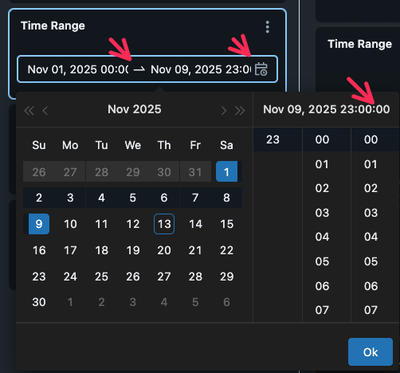
Request: please adjust Databricks AI/BI Dashboard Filter Date Picker built-in style (font size, layout, etc.) so that the full datetime selected for "from" and "to" times are displayed (including all minutes and seconds digits)
Why: it is frustrating as a dashboard user to view or set a datetime from/to range and not be able to see what was the current value is, or what the value just set is.
- Elaboration: in this widget, it is frustrating to have to scroll back and forth, left and right, within each of the two datetime input areas, in order to see and read the full/exact datetime value set, e.g. to simply know what the set value is, which can be critical for setting the filter in order to view the exact data that needs to be reviewed in the dashboard.
Example of the problem (currently in Databricks AI/BI Dashboard filter interface)

Figure 1: Dashboard datetime picker obscures minute and second fields. This is very frustrating to use, when we need to set YYYY-MM-DD HH:MM:SS start and end datetimes in the picker, because it requires a lot of remembering what the values were, clicking around, and changing of values in the selector tool.
Recommended solution (hack)

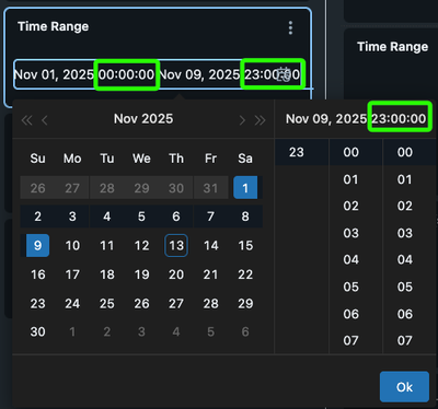
Figure 2: Hacky fix for Dashboard datetime picker to show minute and second fields. This takes two lines of local stylesheet in my web browser, but that does not fix it for the other users of the dashboards.
This could work as a big improvement in my view. At least the full YYYY-MM-DD HH:MM:SS can be seen for both the FROM and TO times. It is okay (though not ideal) that this overlaps the little "calendar" action on the extreme right, if that is what is needed.
Works elsewhere
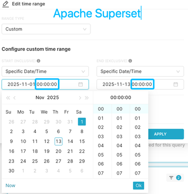
In contrast, the Apache Superset dashboard filter datetime range picker is able to show the full datetime range without obscuring the minute and second fields:

Figure 3: The Apache Superset Dashboard datetime picker shows full minute and second fields, and is usable in that regard