Upset Plot in Databricks

- Mark as New
- Bookmark
- Subscribe
- Mute
- Subscribe to RSS Feed
- Permalink
- Report Inappropriate Content
10-18-2024 11:08 PM
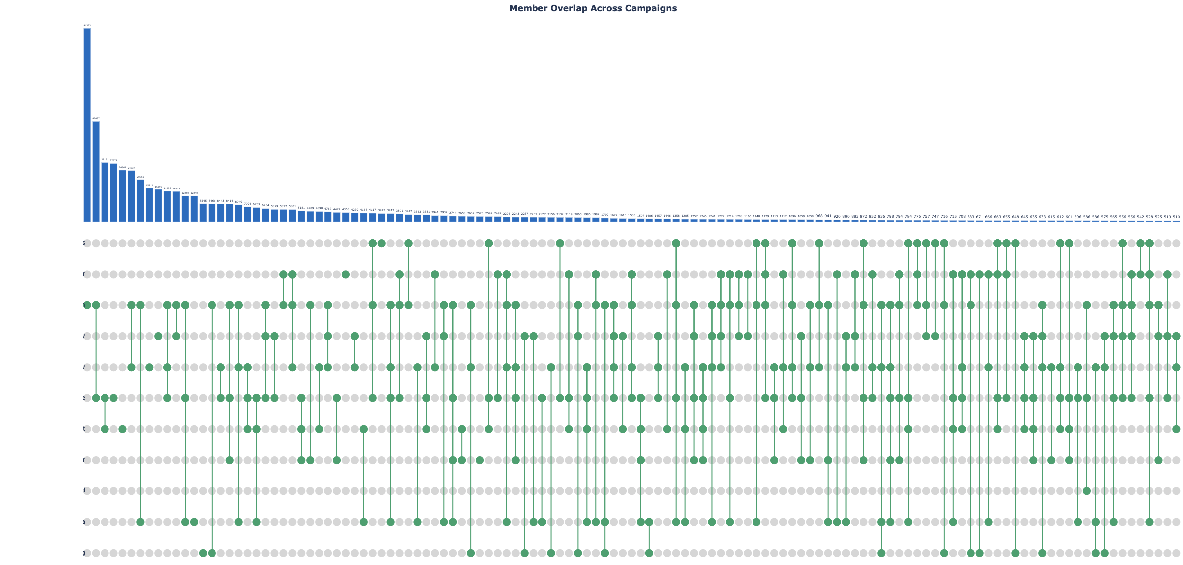
I am trying to create an Upset Plot using following code, but my output is not as expected. See Image1: Output which I am getting vs Image2: Output expected. Where the total count of overlap is displayed at the top of each bar, Bar size is proportionate with the count. it's in descending order. Please help me with this. Thank you.
The code is
import pandas as pd
pip install upsetplot
from upsetplot import UpSet
import matplotlib.pyplot as plt
df_spark=spark.table("hive_metastore.sndbx_cx.q3_data")
df_spark.show(5)
df=df_spark.toPandas()
df=df.drop(columns=['member_id'])
df_counts=df_multi.value_counts()
df=df.astype(bool)
from upsetplot import UpSet
df_multiindex=df.groupby(list(df.columns)).size()
fig=plt.figure(figsize=(15,10),dpi=150)
upset=UpSet(df_multiindex,subset_size='count',show_counts=True,min_subset_size=1,max_subset_size=15)
upset.plot()
plt.show()