Turn Your Dataframes into an Interactive Tableau-Styled Drag-and-Drop UI for Visual Analysis

- Mark as New
- Bookmark
- Subscribe
- Mute
- Subscribe to RSS Feed
- Permalink
- Report Inappropriate Content
01-04-2025 12:38 AM - edited 01-04-2025 12:40 AM
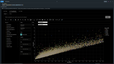
You can create Tableau-styled charts without leaving your notebook with just a few lines of code.
Imagine this: You’re working within Databricks notebook, trying to explore your Spark/Pandas DataFrame, but visualizing the data or performing Exploratory Data Analysis (EDA) feels like a chore. What if you could merge the power of pyspark/pandas with the intuitive, visual magic of Tableau?
That’s where PyGWalker comes in. Originally a binding on top of Graphic Walker, an open-source alternative to Tableau, it allows users to visualize, clean, and annotate data with simple drag-and-drop operations and even natural language queries. If you prefer using R, check out GWalkR, the R wrapper for Graphic Walker.
Here’s why I think it’s worth trying:
💡Interactive Visualizations: Create Tableau-like dashboards directly in Databricks notebooks.
⚡Seamless Integration: No need to switch tools.
🛠️ Drag-and-Drop Simplicity: Save hours on EDA by analyzing Spark, Pandas, and R dataframes in real-time.
💰Cost-Efficient: Open-source and free to use.
Sample code snippet to get started
%python
import pygwalker as pyg
df = spark.table('<catalog.schema.table>') # UC table or can be any pyspark or pandas dataframe
df.cache()
walker = pyg.walk(df)
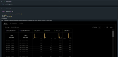
This even comes with a data profiler, providing a quick view of the data and its distribution.
There is support to host a web version of pygwalker using Streamlit,
from pygwalker.api.streamlit import StreamlitRenderer
import pandas as pd
import streamlit as st

# Adjust the width of the Streamlit page
st.set_page_config(
    page_title="Use Pygwalker In Streamlit",
    layout="wide"
)

# You should cache your pygwalker renderer, if you don't want your memory to explode
@st.cache_resource
def get_pyg_renderer() -> "StreamlitRenderer":
    df = pd.read_csv("<file path>")
    return StreamlitRenderer(df, spec="./gw_config.json", spec_io_mode="rw")

renderer = get_pyg_renderer()
renderer.explorer()
And for R users, GWalkR also supports running within a Shiny App.
library(GWalkR)
library(shiny)

app <- shinyApp(
  ui = fluidPage(
    titlePanel("GWalkR in Shiny"),
    gwalkrOutput("mygraph")
    ),
  server = function(input, output, session) {
    output$mygraph = renderGwalkr(
      gwalkr(<dataframe>, dark='dark')
    )
  }
)

if (interactive()) app
While this is by no means a replacement for Tableau or Databricks AI/BI dashboards, it does come with some really neat features like:
- Data painter to remove outliers, clusters and complex patterns directly from the UI.
- Annotate in real-time by adding new features/variables/label.
- The ability to export visualizations and data locally or to the cloud.
- Hosting a standalone web version using Streamlit (supported in Databricks Apps) and Shiny.
- When integrated with Kanaries, it supports a Natural Language interface, allowing users to ask questions in natural language to get answers/visualizations from their data.
