Seaborn plot display in Databricks

- Mark as New
- Bookmark
- Subscribe
- Mute
- Subscribe to RSS Feed
- Permalink
- Report Inappropriate Content
11-16-2018 02:06 PM
I am using Seaborn version 0.7.1 and matplotlib version 1.5.3
The following code does not display a graph in the end. Any idea how to resolve ? (works in Python CLI on my local computer)
import seaborn as sns
sns.set(style="darkgrid")
tips = sns.load_dataset("tips")
color = sns.color_palette()[2]
g = sns.jointplot("total_bill", "tip", data=tips, kind="reg",
                  xlim=(0, 60), ylim=(0, 12), color=color, size=7)
import matplotlib.pyplot as plt
display(plt.show())
Instead of an image, I get the words "None" shown

- Mark as New
- Bookmark
- Subscribe
- Mute
- Subscribe to RSS Feed
- Permalink
- Report Inappropriate Content
03-11-2019 03:01 AM
Duplicate of https://forums.databricks.com/questions/13369/databricks-wont-display-new-plot-seaborn.html. This confused me for a bit as well.
If you create the figure and axes in matplotlib then seaborn will automatically add the plot to it. The figure can then be displayed in the databricks notebook.
fig, ax = plt.subplots()
sns.jointplot("total_bill", "tip", data=tips, kind="reg", xlim=(0, 60), ylim=(0, 12),
          color=color, size=7)
display(fig)

- Mark as New
- Bookmark
- Subscribe
- Mute
- Subscribe to RSS Feed
- Permalink
- Report Inappropriate Content
04-05-2019 12:18 PM
Try changing the last line in your code:
display(plt.show())to
display(g.fig)My results doing that:

- Mark as New
- Bookmark
- Subscribe
- Mute
- Subscribe to RSS Feed
- Permalink
- Report Inappropriate Content
04-23-2020 11:15 AM
As of DBR 6.4+, %matplotlib inline is supported, and you no longer need to call display().

- Mark as New
- Bookmark
- Subscribe
- Mute
- Subscribe to RSS Feed
- Permalink
- Report Inappropriate Content
08-04-2020 02:58 PM
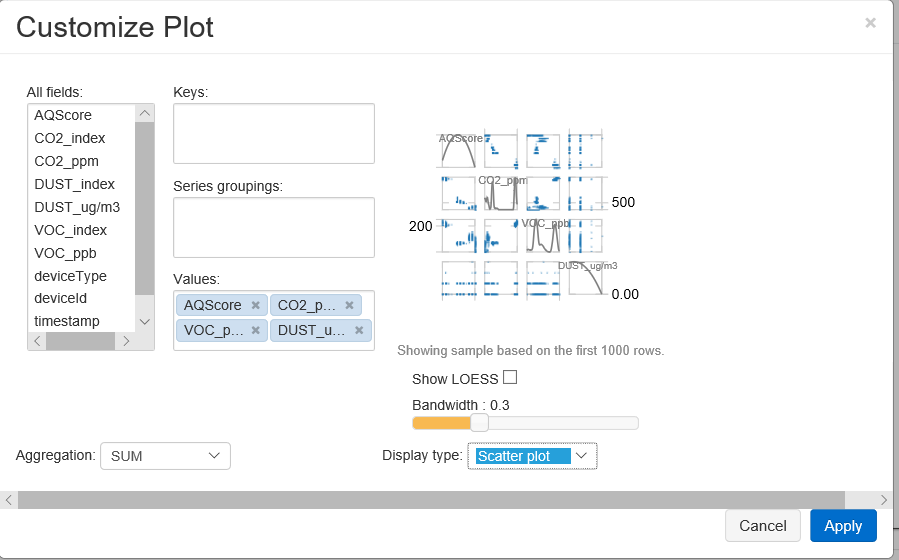
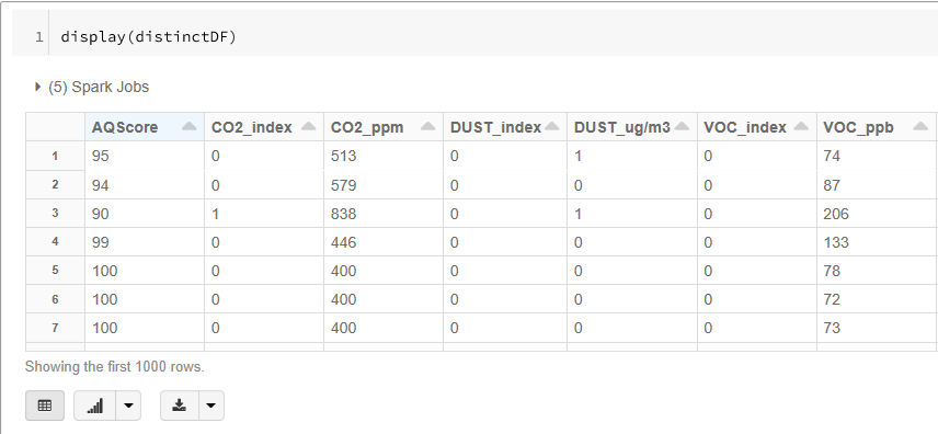
I found that you create a similar comparison plot as what you get from seaborn by using the display(sparkdf) and adding multiple columns to the 'Values' section while creating a 'Scatter plot'. You get to the 'Customize Plot' by clicking on the icon of the bar chart, then the 'Plot Options...' button will show up.