Gantt chart in dashboard
Options
- Mark as New
- Bookmark
- Subscribe
- Mute
- Subscribe to RSS Feed
- Permalink
- Report Inappropriate Content
06-23-2022
01:51 PM
- last edited on
03-21-2025
06:03 AM
by
![]() Advika
Advika
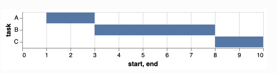
I'd like to create Gantt charts using the dashboard function. It seems like this could be possible by adding some additional parameters in the bar plot functionality, but I don't see how to do it currently (if there is a way, would love an example!).
In altair, this chart type is based on the bar plot, with an additional parameter `x2` that tells where to end the bar.
Example (from altair😞

import altair as alt
import pandas as pd

source = pd.DataFrame([
    {"task": "A", "start": 1, "end": 3},
    {"task": "B", "start": 3, "end": 8},
    {"task": "C", "start": 8, "end": 10}
])

alt.Chart(source).mark_bar().encode(
    x='start',
    x2='end',
    y='task'
)
