Turn on suggestions
Auto-suggest helps you quickly narrow down your search results by suggesting possible matches as you type.
Showing results for
Data Engineering
Join discussions on data engineering best practices, architectures, and optimization strategies within the Databricks Community. Exchange insights and solutions with fellow data engineers.
Turn on suggestions
Auto-suggest helps you quickly narrow down your search results by suggesting possible matches as you type.
Showing results for
- Databricks Community
- Data Engineering
- UI Improvements / Personalization?
Options
- Subscribe to RSS Feed
- Mark Topic as New
- Mark Topic as Read
- Float this Topic for Current User
- Bookmark
- Subscribe
- Mute
- Printer Friendly Page
Options
- Mark as New
- Bookmark
- Subscribe
- Mute
- Subscribe to RSS Feed
- Permalink
- Report Inappropriate Content
08-20-2022 10:07 PM
I have a few suggestions for UI improvement on Databricks console --
Or maybe if anyone has figured out a way (using greasemonkey or similar scripts) to make some changes to Databricks UI -- i would like to know.
# 1 - Workspace Navigation
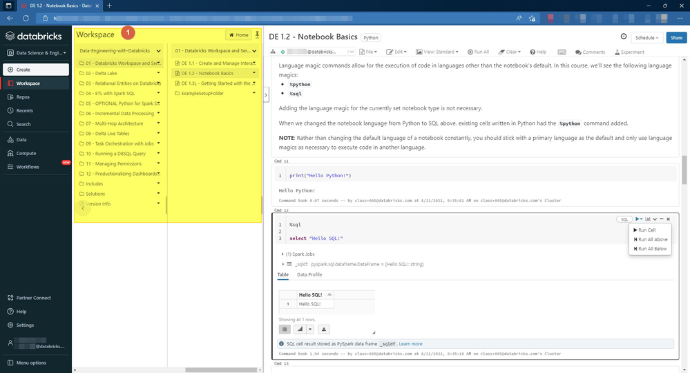
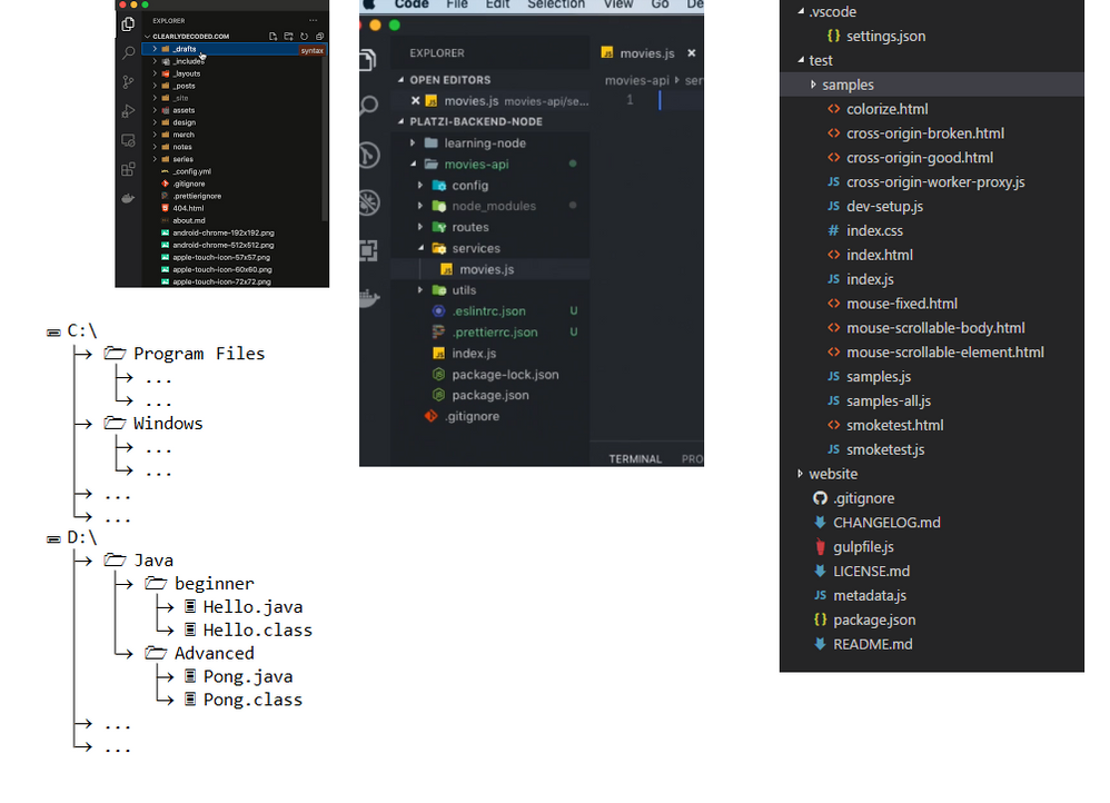
Can we have an option to navigate the Workspace folders and subfolders using a "Tree structure" similar to VS Code or Windows Explorer? Currently there are too vertical panels to move across horizontally and we quickly lose the top level folder context. The current UI also takes up too much space if we look at just two levels of folders and want it pinned.
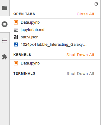
# 2 - Bookmarks
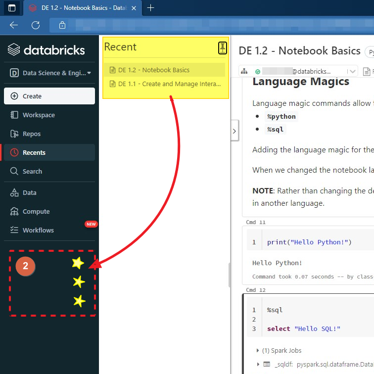
Can the "Recent" links panel itself or a brand new "Bookmarks" panel be added to the main navigation panel on the left?
Make it expand/collapse vertically to save space -- and allow users to pin it open if they want.
If we are auto-populating this panel with "recents" then let users star/ping individual items in that list to make them stay there.
This list can be limited to 3-5 items for example. This will allow users to switch between 3-4 most commonly/recently used notebooks without a lot of clicking and navigational burden.
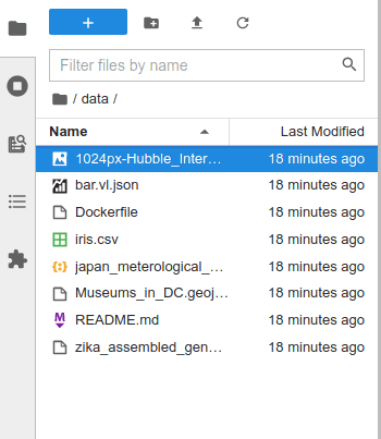
Alternative view from JupyterLab --
# 3 - Tabs & Panels
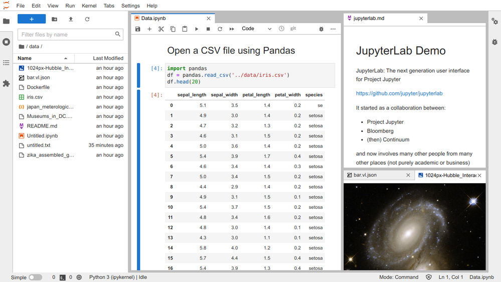
If we open more than one file, can we see them as tabs inside the Workspace?
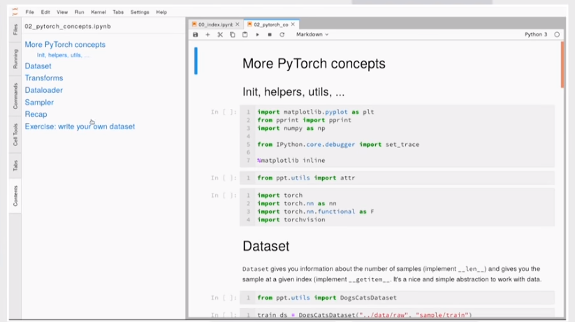
Further could they be displayed in a "split" or "side-by-side" view?
a la JupyterLab --
# 4 - Quick Links on Notebook Cells
Is there a way to make the "Run Cell" option available directly as a single click instead of having to first open a dropdown menu?
I am thinking this can either be a preference setting for user, or a greasemonkey script that runs on user's browser (the latter though are not usually allowed on work machines)

Labels:
1 ACCEPTED SOLUTION
Accepted Solutions
Options
- Mark as New
- Bookmark
- Subscribe
- Mute
- Subscribe to RSS Feed
- Permalink
- Report Inappropriate Content
08-31-2022 01:15 AM
4 REPLIES 4
Options
- Mark as New
- Bookmark
- Subscribe
- Mute
- Subscribe to RSS Feed
- Permalink
- Report Inappropriate Content
08-30-2022 01:33 PM
Great ideas.
I know that regarding #1 new file manager is in development.
#3 I also proposed when we discussed possible improvements.
@Lindsay Olson @Jose Gonzalez @Prabakar Ammeappin maybe we can push it as user feedback as that are great ideas with description and screenshots attached.
My blog: https://databrickster.medium.com/
Options
- Mark as New
- Bookmark
- Subscribe
- Mute
- Subscribe to RSS Feed
- Permalink
- Report Inappropriate Content
08-31-2022 01:06 AM
This really good one. Let me take it to the product team and discuss it with them.
Options
- Mark as New
- Bookmark
- Subscribe
- Mute
- Subscribe to RSS Feed
- Permalink
- Report Inappropriate Content
08-31-2022 01:15 AM
Options
- Mark as New
- Bookmark
- Subscribe
- Mute
- Subscribe to RSS Feed
- Permalink
- Report Inappropriate Content
08-31-2022 03:28 AM
Thank you @Kaniz Fatma 🙂
Announcements
Related Content
- Service principle Personal Access Token permissions in Data Engineering
- Ai query parallel calls in Generative AI
- DeltaFileOperations: Listing improvement? in Data Engineering
- Best Practice in Reading Delta Files in Storage Bucket Created through Fivetran MDLS in Data Engineering
- How do I improve the performance of my Random Forest model on Databricks? in Machine Learning


