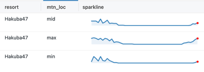
In this post, we'll examine one approach to creating a sparkline in a Databricks Dashboard table.
Approach
As of writing this post, there is no built-in method of creating sparklines in a table, so we need to explore some workarounds. All workarounds involve collecting data into a list and passing it to an SQL query or function that combines the data with renderable HTML or converts it to renderable image data.
The lightweight approach is to wrap the data with HTML and use SVG to render the sparkline. However, SVG can be finicky with its definition and is not straightforward for users who don't have a strong foundation in front-end development. Therefore, we will look at using a Databricks Unity Catalog Python Function that will leverage the more commonly known matplotlib Python library. After the function's definition, all users can simply call it like any other function and get back a visualization.

Setup
The implementation will follow these steps
- UC SQL Python Function Creation
- (optional) Gold table creation
- Application of the function
- Setting visualization option
Let's skip to the application of the SQL so we can see how simple it is to apply the function we'll define later in the article.
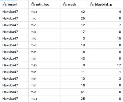
Let's assume our data looks something like this.

And we want to make a sparkline for each resort and mtn_loc as we see in the first screenshot.
This will require you to preprocess data so that there is a single column containing all the points that the sparkline can use. This can either be handled during gold table creation or written as a SQL query such as the one below.
Let's take a look at what the final SQL will look like after the SQL function is defined
SQL query to create an ordered array column as a CTE.
The data is collected into a map and orderd by week and the value is extracted into a list.
Finally the function is applied on the correct data type.
with collections as (
  SELECT
    resort,
    mtn_loc,
    transform(
      array_sort(
        collect_list(struct(week, bluebird_p :: int as bluebird_p))
      ),
      x -> x.bluebird_p
    ) AS bluebird_p_list
  FROM
    yevtushenko_artem.shreddy.snow_powder_history
  where
    resort = 'Hakuba47'
  GROUP BY ALL
)
select
  * except(bluebird_p_list),
  yevtushenko_artem.default.make_sparkline(bluebird_p_list:: string) as sparkline
from
  collections
Next, let's take a look at how we define make_sparkline.
Creating the Function
This article assumes you have read the documentation for CREATE FUNCTION Documentation.
Execute the following SQL replacing the <catalog> and <schema> components with your own UC values.
CREATE FUNCTION <catalog>.<schema>.make_sparkline(input_data STRING)
RETURNS STRING
LANGUAGE PYTHON
AS $$
import matplotlib
import matplotlib.pyplot as plt
import base64
from io import BytesIO
def _sparkline(input_data):
# removes "[" and "]" characters that may be present
data = input_data.replace("[", "").replace("]", "")
data = [int(x) for x in data.split(",")]
figsize = (4, 0.25)
fig, ax = plt.subplots(1, 1, figsize=figsize)
ax.plot(data)
for k, v in ax.spines.items():
v.set_visible(False)
ax.set_xticks([])
ax.set_yticks([])
plt.plot(len(data) - 1, data[-1], 'r.')
ax.fill_between(range(len(data)), data, [min(data)] * len(data), alpha=0.1)
img = BytesIO()
plt.savefig(img, format='png', transparent=True, bbox_inches='tight')
img.seek(0)
plt.close()
return "data:image/png;base64, " + base64.b64encode(img.read()).decode("UTF-8")
return _sparkline(input_data) if input_data else None
$$;
Thanks to Ben Hayes (ben.hayes@databricks.com) for the python script
Once this function is defined the SQL in the Setup section will execute successfully.
Next, we need to make sure the output can be visualized.
Visualization Creation
This is the output of the SQL query where we apply make_sparkline.

Clearly, this isn't a sparkline.
In a dashboard or query editor visualization builder we will create a table visualization.
The important setting to change under settings for the sparkline column is display as.
Select image from the dropdown in the sparkline column display as options
The sparkline should be visualized appropriately now.
Other Considerations
- The Python code is customizable, so you have the flexibility to change the visualization to your liking.
- The image is encoded as a string and can be fairly large, so you may want to consider how many records to show at once. Large amounts of data can slow a dashboard down. Experiment with pagination of tables or application of default filters for best performance.
- Make sure that you grant usage to the function to users.