Turn on suggestions
Auto-suggest helps you quickly narrow down your search results by suggesting possible matches as you type.
Showing results for
Data Engineering
Turn on suggestions
Auto-suggest helps you quickly narrow down your search results by suggesting possible matches as you type.
Showing results for
- Databricks
- Data Engineering
- Wrong X-Axis Order when Visualization is Put on Da...
Options
- Subscribe to RSS Feed
- Mark Topic as New
- Mark Topic as Read
- Float this Topic for Current User
- Bookmark
- Subscribe
- Mute
- Printer Friendly Page
Options
- Mark as New
- Bookmark
- Subscribe
- Mute
- Subscribe to RSS Feed
- Permalink
- Report Inappropriate Content
10-05-2022 04:29 AM
I have a visualization in which the X-axis values are displayed correctly in the Query Editor, in the order produced by the SQL query. However, when I add the visualization to a dashboard, the values are suddenly not sorted anymore.
How is this possible? Is this is bug in the Databricks UI? How do I fix the problem?
Correct (visualization in query editor):
Wrong (visualization on dashboard):

I think this problem might be similar to https://community.databricks.com/s/question/0D58Y00009AICBTSA5/order-by-disabled-in-sql-dashboard; unfortunately, that question does not have an answer.
Labels:
1 ACCEPTED SOLUTION
Accepted Solutions
Options
- Mark as New
- Bookmark
- Subscribe
- Mute
- Subscribe to RSS Feed
- Permalink
- Report Inappropriate Content
12-20-2022 05:47 AM
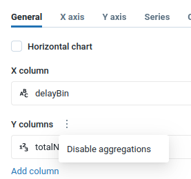
We have further analyzed the visualization problem and found two solutions.
The original visualization consists of 1 series and has aggregation enabled in the UI (but is unused, since the query itself aggregates already).
We found that the following two changes/workarounds solved the problem:
- Adding a 2nd series that visualizes a constant that uses a window function that repeats the desired ordering: "max(0) OVER (ORDER BY binSortUnit, binSortValue ASC) as constantWindowFunction"
- Disabling aggregation in the UI: in the visualization edit window, on the "General" tab, click on the three vertical dots next to "Y columns" and click on "Disable aggregations"
The second solution is the easier one, obviously.

6 REPLIES 6
Options
- Mark as New
- Bookmark
- Subscribe
- Mute
- Subscribe to RSS Feed
- Permalink
- Report Inappropriate Content
10-06-2022 12:58 AM
Hi @Wout Maaskant , Could you please confirm what is the expectation regarding dashboard visualisation?
If I compare one instance, lets say "1 hour(s)" then I see both the graphs are saying the same and the position is same (it is spiked), where as in 6 and 7 hours its the second highest spike.
By default, dashboards are sorted in reverse chronological order. You can reorder the list by clicking the column headings. But in the SQL dashboard I do not see it is in order. Is it what you are asking for?
(Ref: https://docs.databricks.com/sql/user/dashboards/index.html#view-and-organize-dashboards)
Options
- Mark as New
- Bookmark
- Subscribe
- Mute
- Subscribe to RSS Feed
- Permalink
- Report Inappropriate Content
10-06-2022 02:39 AM
Hi @Debayan Mukherjee,
Thanks for your reply.
You are correct in that the values displayed in the graph are the same. (E.g. the spike at "1 hour(s)" has the same value on the y-axis.) I expect the x-axis values to be sorted in the order the SQL query returns them. When I view the visualization in the Query Editor, the x-axis values are sorted correctly, but when I view the same visualization on the dashboard, the x-axis values are sorted incorrectly.
> By default, dashboards are sorted in reverse chronological order. You can reorder the list by clicking the column headings.
I do not believe this quote is not relevant, as it talks about the order of dashboards in the dashboard list.
Options
- Mark as New
- Bookmark
- Subscribe
- Mute
- Subscribe to RSS Feed
- Permalink
- Report Inappropriate Content
10-14-2022 05:34 AM
@Debayan Mukherjee @Lindsay Olson I believe this is a bug in Databricks SQL. Could you please pass this on to second-level/next-level support?
Anonymous
Not applicable
Options
- Mark as New
- Bookmark
- Subscribe
- Mute
- Subscribe to RSS Feed
- Permalink
- Report Inappropriate Content
10-14-2022 09:20 AM
Absolutely, @Wout Maaskant ! Thanks for commenting - the more voices, the better!
Options
- Mark as New
- Bookmark
- Subscribe
- Mute
- Subscribe to RSS Feed
- Permalink
- Report Inappropriate Content
12-13-2022 01:44 AM
It was by going through Databricks Support that we got an answer to this question. I am reposting it here in case others run into the same issue:
---
I researched and found that this is expected behaviour with sorting when added to the dashboard.
Unfortunately, "ORDER BY" is not supported in backend aggregation.
This issue is being caused by new aggregation visualization. In the dashboard, backend aggregation is always used but backend aggregation doesn’t inherit the order by clause specified by the user. The workaround is to use X-axis sort in the visualization editor so the X-axis values are always sorted in the front end.
Although, We have a product feature ticket created to support it. there is no ETA at this moment.
Options
- Mark as New
- Bookmark
- Subscribe
- Mute
- Subscribe to RSS Feed
- Permalink
- Report Inappropriate Content
12-20-2022 05:47 AM
We have further analyzed the visualization problem and found two solutions.
The original visualization consists of 1 series and has aggregation enabled in the UI (but is unused, since the query itself aggregates already).
We found that the following two changes/workarounds solved the problem:
- Adding a 2nd series that visualizes a constant that uses a window function that repeats the desired ordering: "max(0) OVER (ORDER BY binSortUnit, binSortValue ASC) as constantWindowFunction"
- Disabling aggregation in the UI: in the visualization edit window, on the "General" tab, click on the three vertical dots next to "Y columns" and click on "Disable aggregations"
The second solution is the easier one, obviously.
Announcements


Welcome to Databricks Community: Lets learn, network and celebrate together
Join our fast-growing data practitioner and expert community of 80K+ members, ready to discover, help and collaborate together while making meaningful connections.
Click here to register and join today!
Engage in exciting technical discussions, join a group with your peers and meet our Featured Members.
Related Content
- Add Visualization in Notebook to Dashboard, how to set default add to Dashboard Bottom in Warehousing & Analytics
- Notebook Visualisations suddenly not working in Data Engineering
- Dashboard HTML Export: DisplayHTML Formatting Lost in Data Engineering
- Enabling HTML content in Dashboard Visuals in Warehousing & Analytics
- Pausing Dashboard Visualisation before a filter is inputted in Warehousing & Analytics