Turn on suggestions
Auto-suggest helps you quickly narrow down your search results by suggesting possible matches as you type.
Showing results for
Data Engineering
Join discussions on data engineering best practices, architectures, and optimization strategies within the Databricks Community. Exchange insights and solutions with fellow data engineers.
Turn on suggestions
Auto-suggest helps you quickly narrow down your search results by suggesting possible matches as you type.
Showing results for
- Databricks Community
- Data Engineering
- Re: How to fix plots and image color rendering on ...
Options
- Subscribe to RSS Feed
- Mark Topic as New
- Mark Topic as Read
- Float this Topic for Current User
- Bookmark
- Subscribe
- Mute
- Printer Friendly Page
How to fix plots and image color rendering on Notebooks?
Options
- Mark as New
- Bookmark
- Subscribe
- Mute
- Subscribe to RSS Feed
- Permalink
- Report Inappropriate Content
05-08-2023 01:42 PM
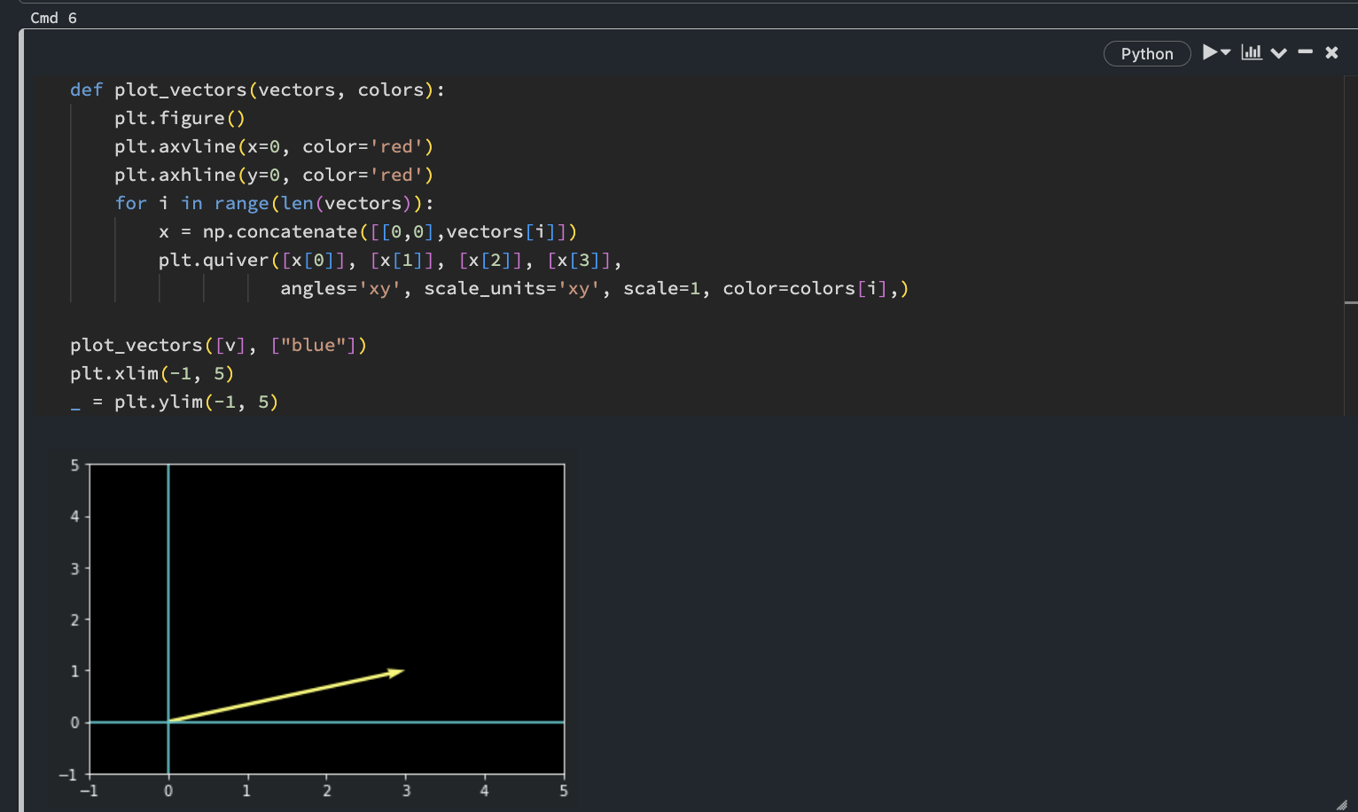
I am currently running dark mode for my Databricks Notebooks, and am using the "new UI" released a few days ago (May 2023) and the "New notebook editor."
Currently all plots (like matplotlib) are showing wrong colors.
For example, denoting:
```
...
plt.figure()
plt.axvline(x=0, color='red')
plt.axhline(y=0, color='red')
...
```
is resulting in teal colored axes. Images also seem to have their colors and hues mixed up.
Is there a way to fix this without giving up any of my current settings for the notebook environment?
Labels:
- Labels:
-
Databricks Notebooks
-
Image


17 REPLIES 17
Options
- Mark as New
- Bookmark
- Subscribe
- Mute
- Subscribe to RSS Feed
- Permalink
- Report Inappropriate Content
05-10-2023 12:41 AM
Hi, Could you please provide a screenshot of the same which will help us understand it better?
Please tag @Debayan with your next comment so that I will get notified. Thank you!
Options
- Mark as New
- Bookmark
- Subscribe
- Mute
- Subscribe to RSS Feed
- Permalink
- Report Inappropriate Content
05-10-2023 01:21 AM
@Debayan Mukherjee
Thanks in advance.
Below is a very simple example of the issue.
I denote the colors "red" for the axes and "blue" for the actual plot, but end up with teal colored axes and a yellow plot.
This is the same for any type of non-text output in the notebook environment, including images, which is the main cause of concern as it can make modeling and other tasks a bit confusing.
Not sure if there is a setting I missed, or if this is some kind of an issue.

Options
- Mark as New
- Bookmark
- Subscribe
- Mute
- Subscribe to RSS Feed
- Permalink
- Report Inappropriate Content
05-10-2023 10:16 PM
@Wonseok Choi thanks for the details. Could you please confirm if you have followed any documents on the same? (https://docs.databricks.com/visualizations/index.html)
Options
- Mark as New
- Bookmark
- Subscribe
- Mute
- Subscribe to RSS Feed
- Permalink
- Report Inappropriate Content
08-11-2023 05:48 AM - edited 08-11-2023 05:50 AM
Hello all,
Thank you @wschoi for reporting this issue. I've lost a lot of time trying to figure out if my image plotting was wrong.


Options
- Mark as New
- Bookmark
- Subscribe
- Mute
- Subscribe to RSS Feed
- Permalink
- Report Inappropriate Content
06-16-2024 04:33 PM
Any updated on this issue? This is a huge drawback to use the dark theme
Options
- Mark as New
- Bookmark
- Subscribe
- Mute
- Subscribe to RSS Feed
- Permalink
- Report Inappropriate Content
06-04-2025 01:52 PM
Still seeing this issue in dark theme June 2025
Options
- Mark as New
- Bookmark
- Subscribe
- Mute
- Subscribe to RSS Feed
- Permalink
- Report Inappropriate Content
06-12-2025 04:26 AM
Two years and counting, no solution to this obvious and very annoying problem so far.
Options
- Mark as New
- Bookmark
- Subscribe
- Mute
- Subscribe to RSS Feed
- Permalink
- Report Inappropriate Content
06-12-2025 11:05 PM
Hi Team, I just checked this post and tried out the above simple plot graph with dark mode UI. It is working as expected for me. Could you please check now?

Options
- Mark as New
- Bookmark
- Subscribe
- Mute
- Subscribe to RSS Feed
- Permalink
- Report Inappropriate Content
06-16-2025 07:14 AM
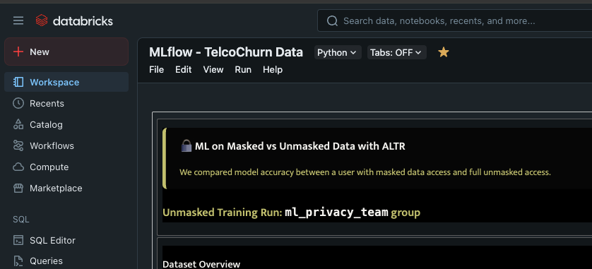
Nope, just checked and the HTML on my notebook dashboard is still displaying wrong color in dark mode. works in light
Options
- Mark as New
- Bookmark
- Subscribe
- Mute
- Subscribe to RSS Feed
- Permalink
- Report Inappropriate Content
06-16-2025 09:51 AM
@andreapeterson could you please share the screenshot along with the code?
Options
- Mark as New
- Bookmark
- Subscribe
- Mute
- Subscribe to RSS Feed
- Permalink
- Report Inappropriate Content
06-16-2025 09:57 AM
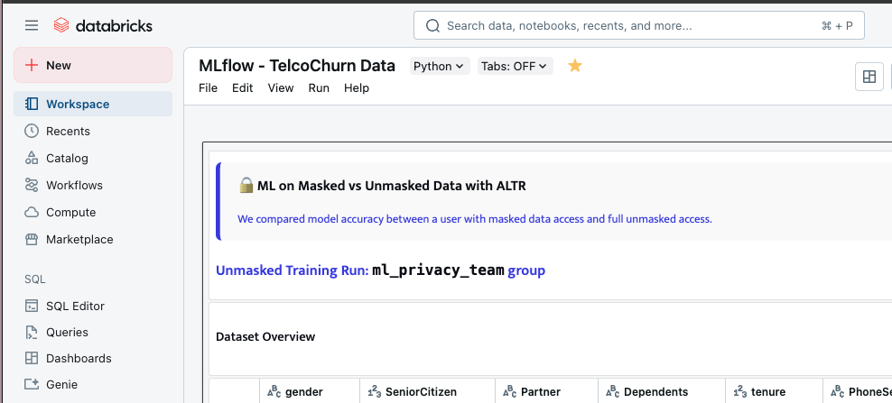
Sure, attached is a small snippit of the worksheet along with 2 pics of display of the code
displayHTML("""
  <link href="https://fonts.googleapis.com/css2?family=Mukta:wght@400;600&display=swap" rel="stylesheet">
  <div style="font-family: 'Mukta', sans-serif; background-color: #fafafa; border-left: 6px solid #4435e6; padding: 16px 24px; border-radius: 8px;">
    <h2 style="color: #080b15; margin-top: 0; font-weight: 600;">
      🔒 ML on Masked vs Unmasked Data with ALTR
    </h2>
    <p style="color: #4435e6; font-size: 16px; margin-bottom: 0;">
      We compared model accuracy between a user with masked data access and full unmasked access.
    </p>
  </div>
  <h2 style="
    font-family: 'Mukta', sans-serif;
    font-size: 20px;
    font-weight: 600;
    color: #4435e6;
    margin-top: 24px;
">
    Unmasked Training Run: <code style='color: #080b15;'>ml_privacy_team</code> group
</h2>
""")
Options
- Mark as New
- Bookmark
- Subscribe
- Mute
- Subscribe to RSS Feed
- Permalink
- Report Inappropriate Content
06-16-2025 10:14 AM
Checking on it.
Options
- Mark as New
- Bookmark
- Subscribe
- Mute
- Subscribe to RSS Feed
- Permalink
- Report Inappropriate Content
06-16-2025 06:36 PM
@andreapeterson, this is likely because the CSS invert filter is applied to certain output types. We have an existing internal ticket(PROD-51027) for this issue, and being worked on.
Either we have a plan to add a setting/toggle for this, which means either invert the colour or keep showing the white background while the site is in dark mode.
Options
- Mark as New
- Bookmark
- Subscribe
- Mute
- Subscribe to RSS Feed
- Permalink
- Report Inappropriate Content
06-17-2025 07:46 AM
Ah okay, thank you!!
Announcements


Related Content
- R plots not rendering in Data Engineering
- SQL Warehouse error: "Cannot read properties of undefined (reading 'data')" when querying system tab in Data Engineering
- Leveraging AI Assistant in Data Engineering Workflows - Share Your Use Cases & Best Practices in Data Engineering
- How to fix plots and image color rendering on Notebooks? in Data Engineering
- Unable to render widget to display map within Jupyter notebook output cell in Data Engineering